As users of technology we look for smarter and quicker ways to get things done with optimum results, which is where good or bad UX/UI comes in.
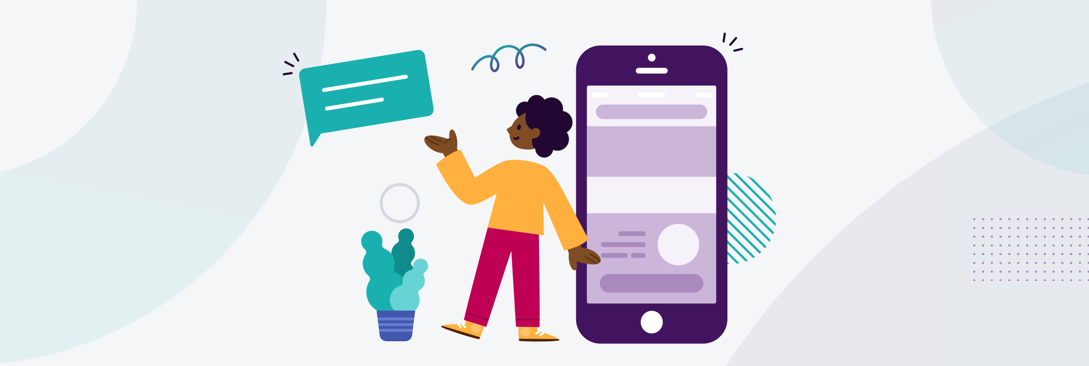
UX and UI while often used interchangeably, actually mean very different things...User experience (UX) design is a human-first way of designing and includes any and all of the interactions between a potential or established customer and a business. While user experience focuses on how to optimise a product for effective and enjoyable use, user interface (UI) design complements it by looking at the presentation, the look and feel and interactive elements of a product.
Simple and intuitive to use, aesthetically pleasing with a consistent design, and speaking the users’ language – are just some of the key UI/UX benefits of the new improved Esendex platform.
When myself and my colleague, Francesco Chianucci, embarked on this project 12 months’ ago we had a very clear objective; to improve on what had gone before and to set a new standard in the business.
From the welcome page right through to building and sending rich customer communications and onto results and analytics, we wanted users to be able to navigate quickly and effortlessly in an environment that had the unmistakable look and feel of Esendex.
We also needed to take full account of the things that users can’t necessarily see that cause huge frustration if they’re not functioning at their best – for example getting the menu structure right, providing an optimum level of system support and feedback, removing unnecessary clicks and reducing the time lost due to page loading times.
It’s a project that touches almost every area of the business, from engineering and product to support through to marketing and design. The new platform sits at the front of a very advanced set of products and features so one of the main UX/UI challenges of the new platform, was to support users to move and to experiment freely and confidently, particularly with communication tools they may not have tried before, in a way that is seamless and intuitive.
As is the case with anything that on the surface looks simple and straightforward, it was a complicated process with many stakeholders and moving parts. From the beginning we stuck to a rigorous UX design approach and looked at our previous platform design in terms of what we could improve, we also researched what was happening in the market and conducted usability testing, which was managed by an external agency, so that every solution and design change made was backed by information gathered from real users. In the end, what you’re working towards – and hoping for – is a perfect combination of aesthetics, functionality, and positive user experience.
From a brand perspective, we now have a really comprehensive design system in place that we can be proud of, and we have a great UX/UI foundation to build on that’s accessible and efficient, regardless of whether you’re a longstanding customer or are new to the platform.
The best endorsement we could possibly receive for the new look Esendex experience comes from early users and testers and so far, that reaction has been really positive:
” I have used 4-8 different platforms and think this is very clear compared to everything else I’ve used before.”
” The overall look and feel is much more consistent as a single, consolidated platform. How soon can we have it?”
The new Esendex experience provides businesses with the data and the tools they need to deliver great experiences at every step of the customer communication journey and the platform design guides them along that journey.