Case studies have shown that simply having a mobile responsive website is not enough to increase conversions. So here are our top tips for improving form completion on a mobile!
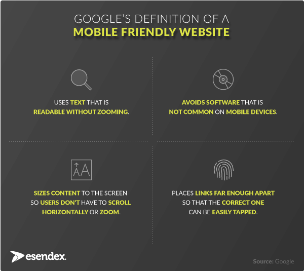
Google’s penalisation of non-mobile optimised websites, dubbed ‘Mobilegeddon’, started in April 2015, and within months, 56% of UK businesses had a mobile friendly website.
The initiative was all about providing the user with a better experience accessing websites from a mobile – specifically:
Mobile users now benefit from an improved aesthetic and no horizontal scrolling, but, surprisingly, this hasn’t significantly improved companies’ ability to interact with their customers on a mobile.
Case studies have shown that simply having a mobile responsive website is not enough to increase conversions (measured by the number of people who complete an action, such as a form, on your website).
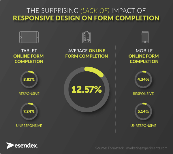
In this particular study, the unresponsive website actually performed better than the responsive website when viewed on a mobile.
The team who conducted the research concluded that, while the purpose of responsive websites is to reduce friction (perceived effort) and anxiety (perceived concern), this doesn’t happen simply by applying Google’s criteria to your website.
Another example from the recruitment industry illustrates the issue: 8% of candidates accessing a job application form on a desktop will complete it, but that drops to 1.5% when accessed via a mobile.*
There’s a lot of advice available online to help you optimise form completion, although most of it isn’t device specific.
Here are our top tips for conversion rate optimisation on a mobile
 Where possible, pre-populate fields so that users don’t have to re-key any data. This requires that they log in before accessing the form, or that they’re sent a unique web link to a personalised form
 Aim for an app-like design that’s free of distractions, and focused on the single goal of getting the user to complete the task. Think Google, not Yahoo!
 Provide clear error messages that appear *when* the error’s occured, not after you’ve clicked to submit the form – it’s incredibly tedious to have to scroll back up to find the error, and to find that other fields have been mysteriously wiped and need to be completed again
 Don’t ask any ‘luxury’ questions – keep your form as succinct as possible – and provide a progress bar so users know how long it’s going to take them to complete the task
 Avoid drop down menus – they look, and are, labour-intensive. You can replace these with radio buttons, steppers, switches, sliders and segmented controls (click here for great examples of all of these interactions).
Esendex’s Mobile Journeys have been specifically created to improve form completion on a mobile device, and with an average click-to-completion rate of 46.5%*, it’s clear that having a mobile-first approach pays off. Try out a Mobile Journey.
*Sources: Eremedia | Esendex customer data
Esendex
The team at Esendex comprises tech experts and experienced marketers who thrive on sharing their know-how, to support prospects and customers to identify the right mobile messaging solutions for their business.