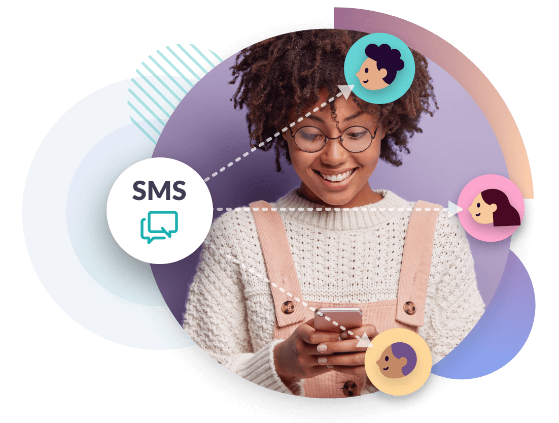
Business SMS messaging
Reach customers in seconds with text message alerts, reminders and campaigns
Our online SMS platform and API offers reliable delivery, simple setup, and the flexibility to support everything from one-off text messages to automated workflows.
Get your messages seen with SMS
SMS is one of the most effective communication channels for businesses. It’s fast, reliable, and delivers real results across customer service, marketing, and operational messaging.

Unrivalled reach
SMS has a 98% open rate and works on any phone, anywhere. Text messages reach your customers when you need them to most.

Fast and real time
With Esendex 90% of messages are delivered within 5 seconds, making SMS ideal for time-sensitive updates, alerts, or reminders.

Trusted and personal
Customers are more likely to read and respond to text messages. SMS feels personal, cuts through inbox noise, and builds trust.
Start your free trial
Discover the full power of our SMS messaging platform with 25 free messages over 7 days, no credit card required.
How our customers are using SMS
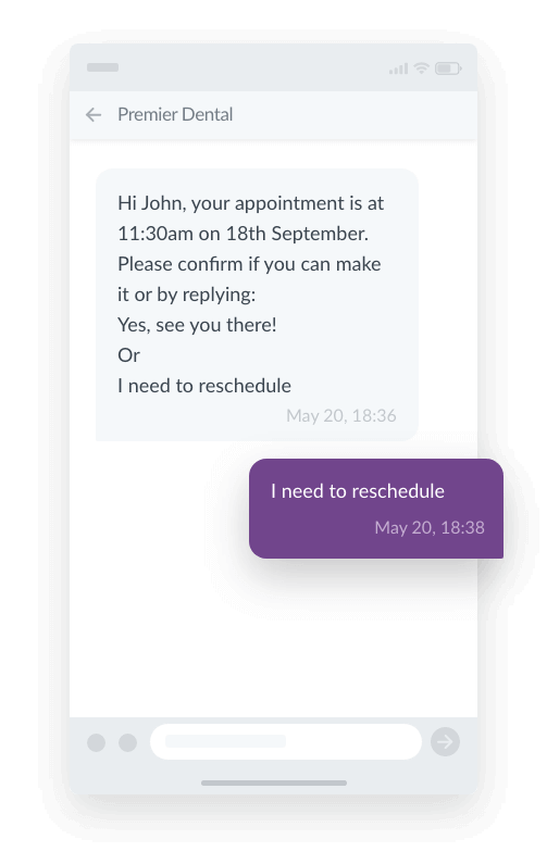
Reminders and confirmations
Whether it’s for appointments, interviews or bookings, 88% of consumers rely on automated SMS reminders. Send personalised confirmations and reminders to reduce no-shows and improve engagement.
Automated texts save time and can be scheduled for the right moment, ensuring customers have important details when they need them.
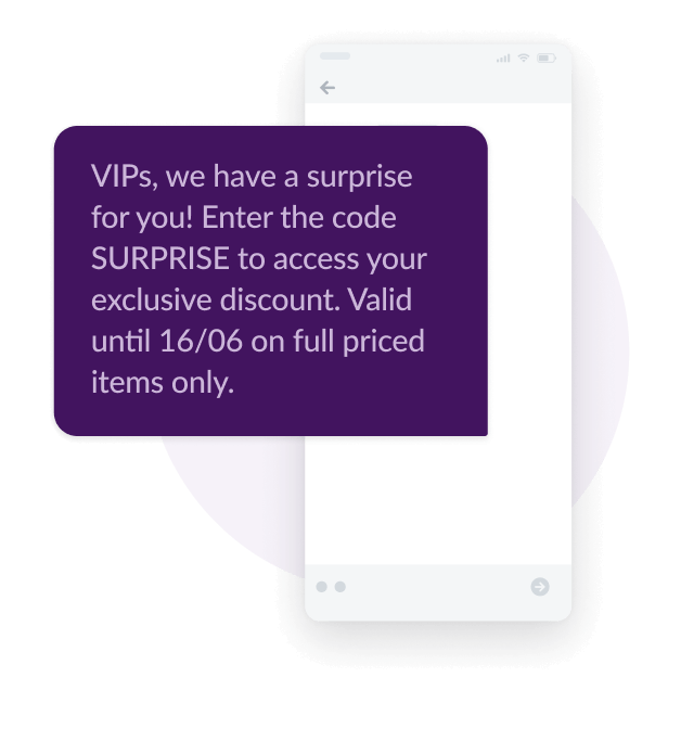
Marketing campaigns
Got a sale coming up? Let customers know by sending snappy and conversational texts tailored to their interests.
SMS cuts through busy inboxes and with open rates up to 98%, it’s almost guaranteed to be seen. Enhance your promotions, events and campaigns by getting in front of customers at the right time.
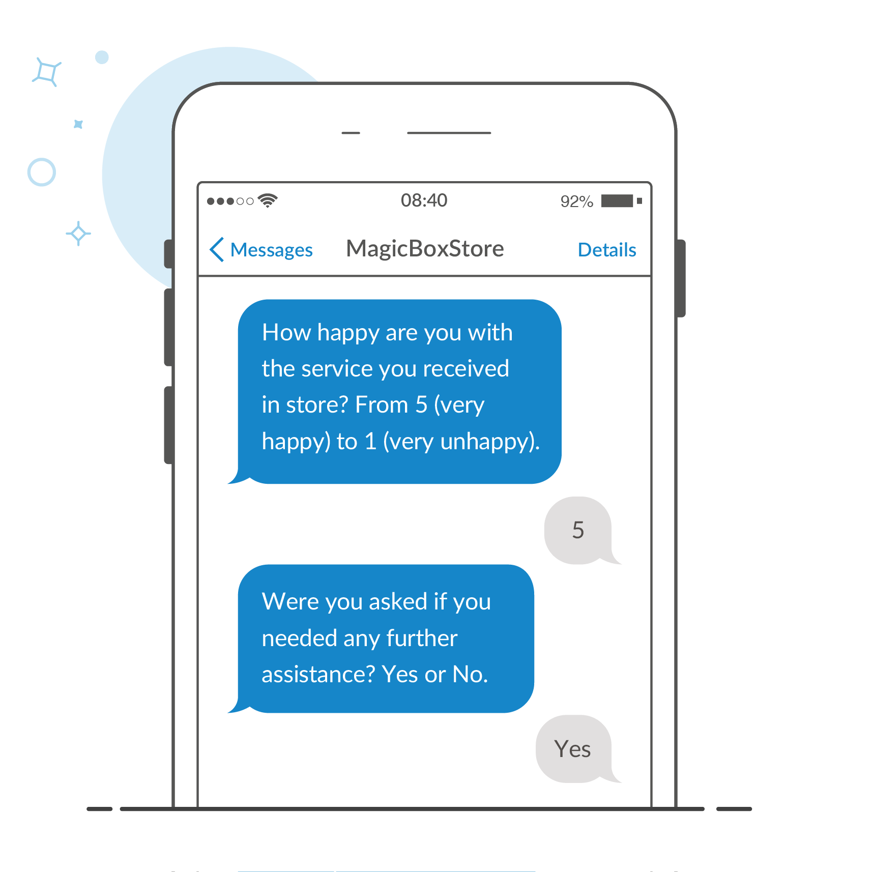
Surveys and feedback
Send short and engaging SMS surveys after key interactions such as a purchase, enquiry or support case.
It’s a quick and convenient way to gather both quantitative and qualitative insights that help you improve your products, services and customer experience.
“We’ve seen a big uptick in our numbers, but more importantly, we’re also providing better services and tools to our customers.”
Gareth Hall – Senior Collections Manager, Debt Managers
Explore all SMS features
Scroll to learn more about the key features available through our SMS platform and API:
MASS TEXTING
Bulk SMS
Send high-volume business messages quickly and reliably. Share updates, offers, or alerts with your entire audience in just a few clicks.
INTEGRATE SMS
SMS API
Integrate SMS into your existing systems with our flexible, developer-friendly API. Quick to set up with clear documentation and support.
SEND ONLINE
Online platform
Send and manage messages with ease using our intuitive web-based platform. Fast to set up, simple to use, and ready to scale with your business.
BRAND & PERSONALISE
SMS landing pages
Boost engagement with personalised, mobile-friendly landing pages sent via SMS. Fully branded and designed to increase clicks and conversions.
STREAMLINE TOOLS
Email to SMS
Send text messages directly from your email platform without switching tools. Reach your audience quickly while keeping all communication in one place.
AUTOMATE MESSAGING
SMS Automations
Save time by automating routine communications like reminders or status updates. Improve efficiency while delivering a seamless customer experience.
SMART AND SIMPLE
SMS Short Codes
Use memorable five-digit numbers for promotions, surveys, or customer replies. Ideal for high-volume two-way messaging and brand recall.
INTEGRATE SMS
SMS Gateway
Send messages efficiently at scale through our powerful SMS gateway. Designed for high deliverability and cost-effective communication.
CUSTOMER SERVICE
SMS chat
Deliver fast, personal support through two-way SMS conversations. Improve response times and reduce pressure on your support team.
Esendex, your reliable business messaging partner
Trusted by thousands of businesses, Esendex delivers the scale, experience, and support needed to power reliable SMS communication at every stage of the customer journey.
20+ years experience
We’ve been helping businesses send text messages to customers for over two decades. Our team brings in-depth knowledge and technical expertise to every solution we deliver.
46,000+ customers
Organisations of all types and sizes trust Esendex to power their communications. From fast-moving retailers to highly regulated sectors, we support a wide range of messaging needs.
5B+ messages per year
Our platform is built for high performance at scale. Every year, we deliver billions of SMS messages with the speed, security and reliability our customers rely on.
Security and compliance
We’re ISO 27001 certified and fully GDPR compliant. From data protection to message delivery, security is at the core of everything we do.
Global reach
Send messages worldwide with confidence. Our direct carrier connections and in-country knowledge ensure reliable delivery across borders.
Flexible integration
Use our intuitive web platform or connect via API. Whether you’re sending one-off messages or building complex automations, we give you the flexibility to work your way.
Start your free trial
Discover the full power of our SMS messaging platform with 25 free messages over 7 days, no credit card required.
Messaging solutions for your sector
From customer updates to appointment reminders, our powerful messaging platform is helping businesses across sectors communicate more effectively. See how it’s making an impact in businesses like yours:

Send order confirmations, delivery updates, and time-sensitive offers that customers actually see.
With open rates up to 98%, SMS helps retailers cut through the noise and drive real results — from cart recovery to loyalty program engagement.

Deliver secure, time-critical messages like fraud alerts, one-time passwords, and appointment reminders.
SMS supports compliance needs while helping reduce missed communications and inbound call volume.

Reduce no-shows and improve patient satisfaction with automated appointment reminders, test result notifications, and care follow-ups.
SMS helps healthcare providers reach patients quickly and respectfully.
Let’s start sending, together.
Discover the full power of our mobile messaging platform.